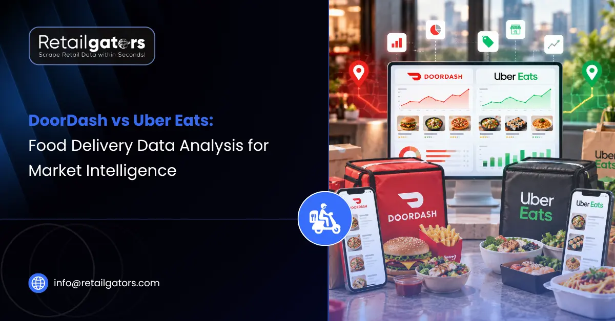
A restaurant group opens a new location, lists it on both DoorDash and Uber Eats, and within a few weeks notices something odd. The same burger costs a different amount on each app, delivery fees swing depending on the hour, and a competitor two blocks away seems to run a promotion every weekend. Everyone on the team has an opinion about what’s going on, but nobody has consistent evidence. Screenshots get passed around in Slack, and a spreadsheet gets started and abandoned. This is the gap that food delivery data intelligence is meant to close: turning scattered observations from delivery apps into something a pricing or strategy team can rely on.
DoorDash and Uber Eats look nearly identical from the customer’s side of the screen. From a data standpoint, though, the interesting differences are in the values rather than the fields: what each platform charges, which offers it surfaces, how ratings accumulate, and how all of it shifts by neighborhood and time of day. That’s what a proper DoorDash vs Uber Eats data analysis is really about.
DoorDash vs Uber Eats Data Analysis: What Actually Differs?
Start with the part that doesn’t differ much. Both platforms organize information around a similar backbone: a restaurant or store profile, a menu with categories and items, prices, modifiers and add-ons, delivery and service fees, estimated delivery times, ratings, and promotions. If you’re building a data schema, the two look more alike than different.
The differences appear once you look at what fills those fields. Prices for the same dish can vary between platforms, because restaurants set menu prices per platform and some adjust them to offset commission costs. Fees are a second source of variation, since delivery and service charges depend on distance, demand, order size, and whether the customer belongs to a membership program such as DashPass on DoorDash or Uber One on Uber Eats. Promotions differ as well, both in structure (percentage discounts, free delivery thresholds, buy-one-get-one offers) and in how prominently they’re displayed.
Then there’s location. Nearly everything on a delivery app is tied to a delivery address, so the restaurants shown, the fees quoted, and the estimated times all change from one postcode to the next. A dataset collected for one city says very little about another, and even within a single city the picture can shift between neighborhoods. Coverage, restaurant participation, and platform popularity also vary by market, which is why “which platform is bigger?” is rarely the question that helps a business decide anything.
Menu Data: More Than a List of Dishes
Menu data is usually the first thing teams want to collect, and it’s richer than it appears. Item names, descriptions, categories, sizes, modifiers, add-ons, and images all sit inside a single menu listing, and each layer answers a different question.
Item names and descriptions show how competitors position their food. A restaurant that rewrites its descriptions to emphasize “house-made” or “locally sourced” is making a positioning move, and tracking those changes over time makes that visible. Category structure shows what a competitor considers its headline offering: whether combos sit at the top, whether desserts are pushed as an upsell, whether a new item is placed in a featured slot.
Modifiers and add-ons are easy to overlook and surprisingly informative. Extra cheese, a larger size, a premium side: these are where a lot of margin is made, and comparing how competitors price them can reveal pricing logic that base menu prices hide. Menu changes also work as an early signal. New items appearing, items disappearing, or a full menu restructure often precede a strategic shift, such as a new cuisine focus or a virtual brand launch.
For brands and multi-location operators, menu data has a quieter but practical use: checking consistency. If the same item shows up with different descriptions, prices, or availability across platforms or locations, that’s usually an operational problem worth catching early.
Restaurant Pricing Data and Fee Structures
Restaurant pricing data on delivery apps has to be read in layers. The menu price is one layer. On top of it sit delivery fees, service fees, small-order charges, and in some cases location-based or demand-based adjustments. What the customer ultimately pays, the total basket cost, is the number that drives ordering behavior, and it’s the number many pricing analyses forget to capture.
This matters because two restaurants with identical menu prices can look very different once fees are included, and the reverse is also true. A competitor advertising lower item prices may be losing that advantage entirely at checkout. Comparing menu prices alone is a bit like comparing airline base fares without checking the baggage charges.
Menu prices on delivery platforms are also often different from in-store prices, since restaurants may price higher on apps to absorb platform commissions. Businesses benchmarking themselves against competitors need to know which comparison they’re making: app price against app price, or app price against dine-in price. Both are valid, but mixing them produces confusing conclusions.
Pricing behavior over time is where the depth is. A single snapshot tells you where prices sit today. Regular collection reveals whether a competitor raises prices ahead of weekends, whether fees climb during dinner hours, and how quickly they respond when a nearby rival launches a promotion. Teams that want to track this consistently usually end up building around a price monitoring workflow rather than one-off checks.
Promotions, Ratings, and Customer Signals
Promotions are the most volatile piece of delivery data. Discounts start and stop quickly, and the same offer might show up on one platform and not the other. Tracking promotion depth, frequency, and timing shows how aggressively competitors are chasing new customers versus retaining existing ones. A restaurant that discounts every Tuesday is telling you something about its demand curve. It’s also worth noting whether offers are funded by the restaurant or the platform, though that detail isn’t always visible from the outside.
Structured tracking of competitor pricing and promotion activity helps here, because the interesting insight usually isn’t a single discount. It’s the pattern: which categories get discounted, how often, and how deep.
Ratings and reviews add the customer’s voice. Star ratings summarize satisfaction, but review text is where the specifics live: late deliveries, missing items, portion complaints, praise for a particular dish. Because ratings on DoorDash and Uber Eats accumulate separately, the same restaurant can carry different scores on each platform, and that gap sometimes points to platform-specific delivery issues rather than food quality. Analyzing this feedback at scale is easier with a dedicated sentiment analysis approach than by reading reviews one at a time.
Food Delivery Analytics for Competitor Analysis
Competitor analysis in food delivery is really about defining the right competitive set. On a delivery app, your competitors aren’t necessarily the restaurants you think of as rivals. They’re whoever shows up next to you in the customer’s feed for a given address and time: the same cuisine, the same price tier, or simply the same craving.
Good food delivery analytics starts by mapping that set by location. From there, a few comparisons tend to be useful. How does your average basket price compare with the local set once fees are included? How does your menu breadth compare? Where do you sit on delivery time estimates and ratings? Which competitors are gaining visibility, and which are quietly fading out?
The value compounds over time. A restaurant chain evaluating a new market can look at existing competitors’ pricing, menu depth, and promotion intensity before committing to a location. A delivery-focused brand can spot underserved cuisines in a neighborhood by comparing listing density against demand signals. A structured competitive benchmarking approach makes these comparisons repeatable instead of anecdotal.
DoorDash vs Uber Eats Data Comparison Table
| Data Area | DoorDash | Uber Eats | Business Use |
| Restaurant profiles | Name, cuisine, hours, location, ratings | Name, cuisine, hours, location, ratings | Competitor mapping, market coverage |
| Menu data | Categories, items, modifiers, add-ons, images | Categories, items, modifiers, add-ons, images | Menu benchmarking, positioning analysis |
| Item pricing | Set per platform; can differ from in-store | Set per platform; can differ from in-store | Restaurant pricing data comparison |
| Fees | Delivery and service fees; may vary by location and membership | Delivery and service fees; may vary by location and membership | Total basket cost analysis |
| Promotions | Discounts, free delivery thresholds, deals | Discounts, free delivery thresholds, deals | Promotion strategy, competitor tracking |
| Ratings and reviews | Accumulated separately per platform | Accumulated separately per platform | Sentiment analysis, service quality checks |
| Delivery time estimates | Location- and demand-dependent | Location- and demand-dependent | Operational benchmarking |
| Availability | Open/closed status, item availability | Open/closed status, item availability | Demand and operations signals |
| Coverage | Varies by market | Varies by market | Market entry, expansion planning |
Which Platform’s Data Should Your Business Track?
There isn’t a universal answer, and defaulting to “both” isn’t always the smartest starting point either. It depends on what you’re trying to decide.
If you’re a restaurant operator focused on pricing, you’ll want both platforms’ menu prices and fees for your own locations and your direct competitors, because your customers may be comparing across apps. If you’re a franchise or multi-location brand, consistency monitoring matters more: are prices, descriptions, and availability aligned across every location and platform?
If you’re evaluating a new market, coverage and density matter most, so you’d want listings, cuisine mix, and pricing tiers for the neighborhoods you’re considering. If you’re a CPG or food brand, the relevant view might be how your products are priced and merchandised across the grocery and convenience partners that both platforms now carry. And if you’re a delivery aggregator or market research firm, combining both platforms is close to essential, since a single-platform view under-represents the market.
Why Automated Collection Matters
Checking delivery apps by hand works for a handful of restaurants on a single afternoon. It falls apart quickly beyond that. Delivery data is tied to specific addresses, changes throughout the day, and multiplies fast once you’re tracking several neighborhoods, dozens of competitors, and two platforms. Manual checks also produce inconsistent records, because different people capture different fields at different times.
Automated collection on a fixed schedule fixes most of that. It gives you comparable snapshots, a growing price and promotion history, and structured output that can flow straight into dashboards or internal tools. It also frees analysts to interpret the data instead of gathering it.
That said, it isn’t a shortcut around the rules. Collection should respect each source’s terms of use, technical restrictions, and applicable legal requirements, and it should stay limited to publicly available information. Personal customer data isn’t part of legitimate market intelligence and shouldn’t be collected. Feasibility can also vary by platform and by data field, so it’s worth confirming what’s realistic before building a program around it.
How RetailGators Supports Delivery Market Intelligence
Once a team knows which data it needs, the practical question becomes how to collect it reliably without building and maintaining the infrastructure in-house. RetailGators’ food delivery intelligence work covers menu prices, delivery fees, discounts, ratings, reviews, and competitor activity by location, structured so it can support pricing decisions, menu planning, and market analysis.
Because delivery data often lives inside apps as much as on websites, RetailGators also offers mobile app scraping for supported applications, which can be relevant when the fields you need aren’t easily reached through a standard web page. Data can be delivered through APIs, dashboards, or scheduled feeds, and teams that want to connect it to existing systems can look at web scraping API services. For teams that would rather see the data than pipe it somewhere, a custom analytics dashboard can present pricing, promotion, and competitor movement in a form decision-makers actually use.
Businesses that want to see what this looks like for their own markets can request a free pilot run or talk through their requirements with the RetailGators team to work out which platforms, locations, and fields make sense to start with.
Conclusion
DoorDash and Uber Eats share a similar data structure, so the value of a DoorDash vs Uber Eats data analysis lies less in comparing fields and more in comparing what’s inside them: menu prices, fees, promotions, ratings, and how all of it shifts by location and time. Neither platform is a universal winner as a data source. Each one shows a slice of the market, and the fuller picture comes from tracking them against a specific business question.
The pattern holds across most use cases: data leads to analysis, analysis to market intelligence, and intelligence to a pricing, menu, or expansion decision. Teams that define the decision first and collect the data second tend to end up with less noise and more usable insight. If you’re working out what delivery market intelligence should look like for your own locations and competitors, RetailGators can help scope a collection approach that fits.